Worst of the web award: Cheaptickets
Here’s a great example of terrible (for me at least) UI design.
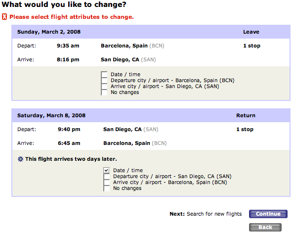
I was just trying to change a ticket booking at Cheaptickets. Here’s the interface for selecting what you want to change (click to see the full image).
As you can see, I indicated a date/time change on my return flight. When I clicked on the continue button, I got an error message:
An error has occurred while processing this page. Please see detail below. (Message 1500)
Please select flight attributes to change.
I thought there was some problem with Firefox not sending the information that I’d checked. So I tried again. Then I tried clicking a couple of the boxes. Then I tried with Opera. Then I changed machines and tried with IE on a windows box. All of these got me the exact same error.
I looked at the page several times to see if I’d missed something – like a check box to indicate which of the flights to change. I figured Cheaptickets must have an error server side. Then I thought come on, you must be doing something wrong.
Then I figured it out. Can you?
You can follow any responses to this entry through the RSS 2.0 feed. Both comments and pings are currently closed.


February 14th, 2008 at 5:33 pm
This seems liek a trick question. You need to select ‘no changes’ for the journey you aren’t changing, right?
February 14th, 2008 at 6:33 pm
This seems liek a trick question. You need to select ‘no changes’ for the journey you aren’t changing, right?
February 14th, 2008 at 7:03 pm
obvious, dude. you need a check in the “no changes” box for the first flight. you’re such a n00b.
February 14th, 2008 at 8:03 pm
obvious, dude. you need a check in the “no changes” box for the first flight. you’re such a n00b.
February 14th, 2008 at 7:50 pm
You might want to try Trabber, it works nicely. It has websites for doing local searches (Spain, UK, US, etc.).
February 14th, 2008 at 8:50 pm
You might want to try Trabber, it works nicely. It has websites for doing local searches (Spain, UK, US, etc.).
February 14th, 2008 at 9:43 pm
OK, so suddenly everyone’s a UI expert around here…?
That was it. It sure wasn’t obvious to me. I guess the “No changes” selector just shouldn’t be there. If you don’t want to do anything to the ticket, you shouldn’t have to do anything, not say “yes, by clicking here I indicate that I don’t want to do anything”. And at the very least the server software should assume that no selected attributes means no changes.
February 14th, 2008 at 8:43 pm
OK, so suddenly everyone’s a UI expert around here…?
That was it. It sure wasn’t obvious to me. I guess the “No changes” selector just shouldn’t be there. If you don’t want to do anything to the ticket, you shouldn’t have to do anything, not say “yes, by clicking here I indicate that I don’t want to do anything”. And at the very least the server software should assume that no selected attributes means no changes.
February 20th, 2008 at 9:47 am
Terry,
Interesting find- in general, though, I find the cheaptickets interface is fairly good. In the travel vertical there are examples of far, far, far, far more frustrating!
btw, replied to your comment on my Chumby post. One thing that still annoys me about blogs is how I can reply to someone’s comment and trust that the reply will get to the person. Any idea?
February 20th, 2008 at 10:47 am
Terry,
Interesting find- in general, though, I find the cheaptickets interface is fairly good. In the travel vertical there are examples of far, far, far, far more frustrating!
btw, replied to your comment on my Chumby post. One thing that still annoys me about blogs is how I can reply to someone’s comment and trust that the reply will get to the person. Any idea?